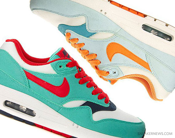
Founder & Editor In Chief
Yu-Ming Wu
@mryumingwu
liquidrice.com

Managing Editor
Aaron Kr.

Editors
Aaron Hope
Brendan Dunne
John Kim
    Top Categories
  • Home
  • Air Jordan
  • Air Force 1
  • Air Max
  • Adidas
  • Basketball
  • Celebrity Feet
  • Foamposite
  • Kobe Bryant
  • Kevin Durant
  • Nike SB
  • LeBron James
  • Just Released
  • Upcoming Sneakers

  • All Categories
Archives


By John K. · Published Dec 01st, 2010

Nike Air Max 95   Obsidian   Blue + Dark Shadow   Green | Reverse Logo

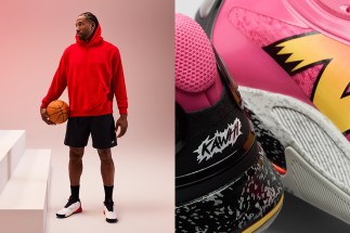
Just what exactly is going on here? We’ve got two great all-new colorways of the classic Air Max 95 – one in Obsidian/Light Photo Blue and the second in Dark Shadow/Lucky Green – but with an interesting alteration that will leave you scratching your head in amusement. The ‘AIRMAX’ logo, customarily on the tongue of the Air Max 95, has been transported to the upper achilles where the tiny swoosh usually sets up shop. The swoosh on the tongue is definitely passable, but what are your thoughts on the popular Air Max badge on the upper? Is it out of place or a nice touch that adds a fresh new spin on the 95? We’ve seen some interesting spins on the 95 like the smaller bubbled ‘Zen’ releases, the jeweled swoosh (how we miss thee), and the leather-uppered Zipper 95s. Check out the detailed images of both new colorways because JDSports has both the Obsidian/Blue and Dark Shadow/Green pairs available, and let us know what your thoughts are on this logo switcheroo.

Nike Air Max 95   Obsidian   Blue + Dark Shadow   Green | Reverse Logo

Nike Air Max 95   Obsidian   Blue + Dark Shadow   Green | Reverse Logo

Nike Air Max 95   Obsidian   Blue + Dark Shadow   Green | Reverse Logo

Nike Air Max 95   Obsidian   Blue + Dark Shadow   Green | Reverse Logo

Nike Air Max 95   Obsidian   Blue + Dark Shadow   Green | Reverse Logo

Nike Air Max 95   Obsidian   Blue + Dark Shadow   Green | Reverse Logo

Continue Reading | Page 1 | 2 |


13 Responses to “Nike Air Max 95 – Obsidian – Blue + Dark Shadow – Green | Reverse Logo”

  1. TR3WATS Says:

    Change Options Variety Different in the shoe game is always good IMO.

  2. workin Says:

    I dig it. Its a nice, subtle change that mostly the s'neads will notice. And its all about the attention getters.

  3. d1208 Says:

    i don't like it…almost makes it look i dont wanna say fake but kinda "generic"

  4. broskiijace Says:

    Different,But Stylish!!!!

  5. Will Says:

    eh not the best , but could def be used in better colorways I believe…

  6. ced Says:

    lol dose r cool nice change

  7. steven T Says:

    they look fake

  8. oso fresh Says:

    the obsidian ones are nice

  9. budman Says:

    straight ghetto.

  10. El Ultimo Hombre Says:

    Weak attempt at selling more shoes.

  11. jeezy Says:

    i like em… but id rather see the air max logo on the heel tab and jus not put a nike air logo but thats just my opinipn

  12. fAIR Says:

    I like these, simple colorway and I like the reverse logo.

  13. jedi Says:

    how do they look fake ,??? the r and m is connected on the logo making it look like airnax or aimax this is the style of all 95s all these people who have never bought a real pair of air max 95 but claim all the ones they see are fake .go to foot locker you little tramps and stop talking shite

Login or Register to Leave a Comment

Make sure to Register if you comment regularly. Registration is easy, it only requires your email and a username.

Leave a Comment as Guest:

Write Your Comment Here:


RECOMMENDED POSTS

© Liquidrice, Inc. | Sneaker News is a Liquidrice, Inc. Company

Page optimized by WP Minify WordPress Plugin