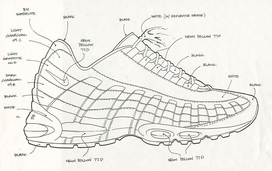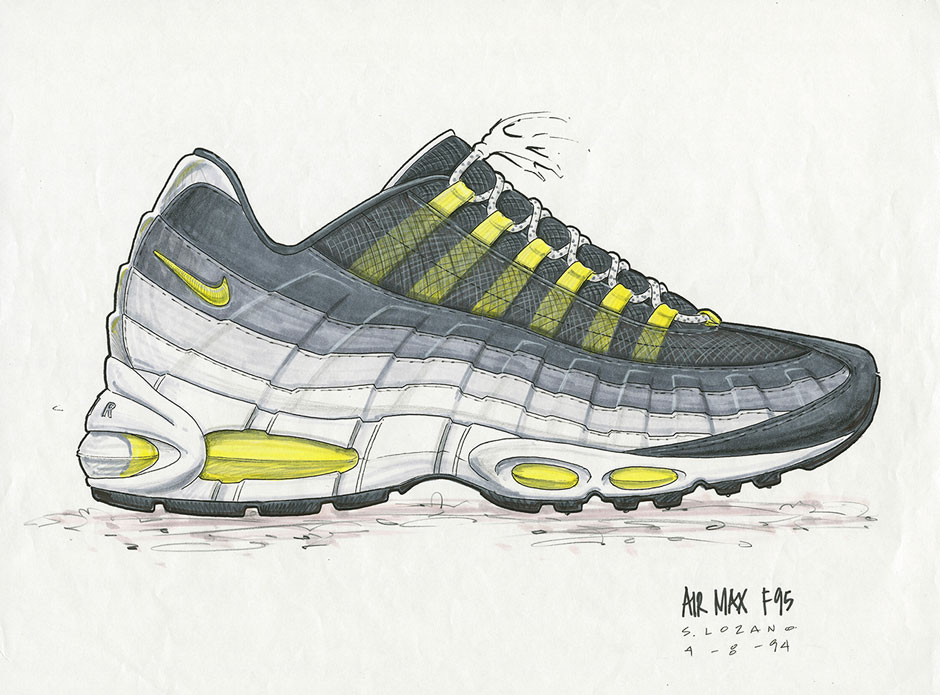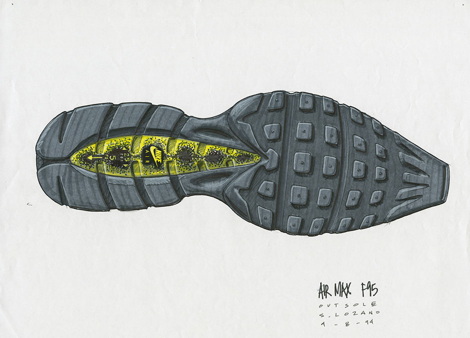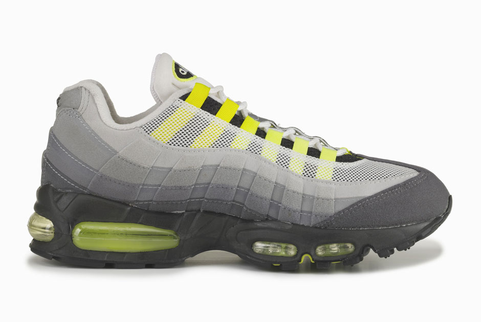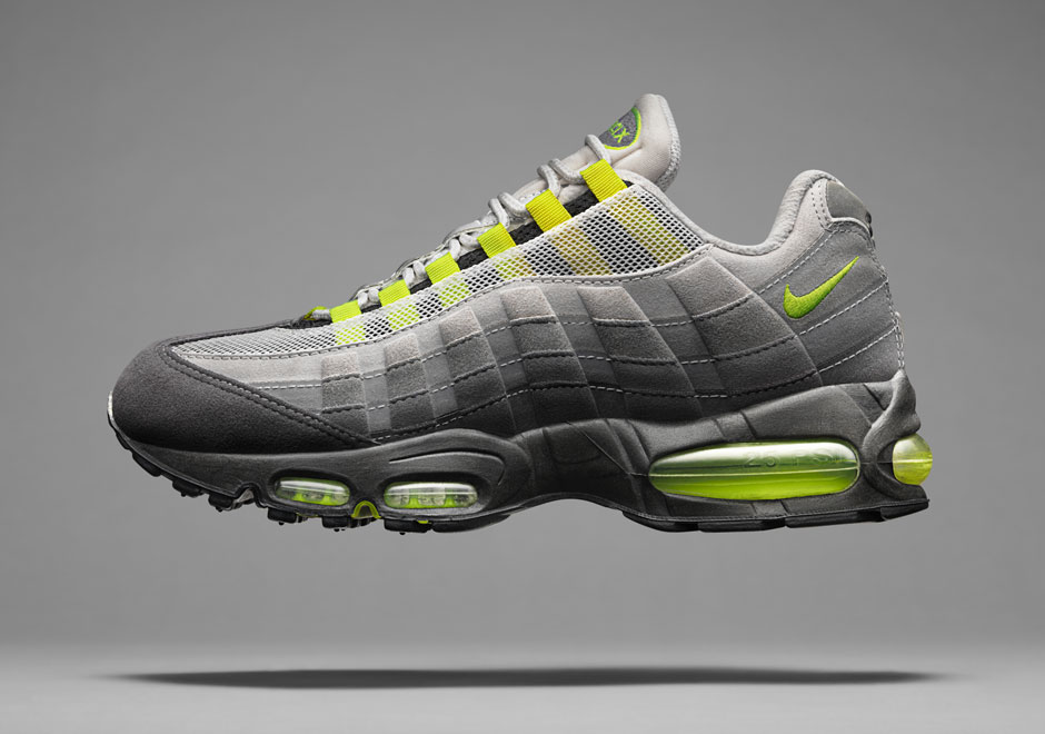
By the mid-90s, Nike Basketball had taken rule over the brand and other robust categories such as Running and Training were tasked with keeping up with the the hoops game. Nike knew that for the 1995 flagship model, nothing short of striking the right chord with such volume would be considered a success. After all, the brand prizes itself for being the best of the best, so first-time Running designer Sergio Lozano had quite a challenge ahead of him. Fortunately, Lozano’s experience with Nike ACG provided to be a solid foundation for a ground-breaking shoe, and despite initial resistance of the ambitious architect’s initial sketches, Sergio was determined to push forward with his iconoclastic vision.
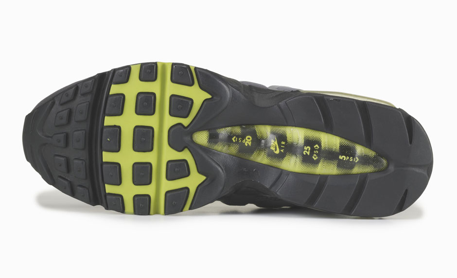
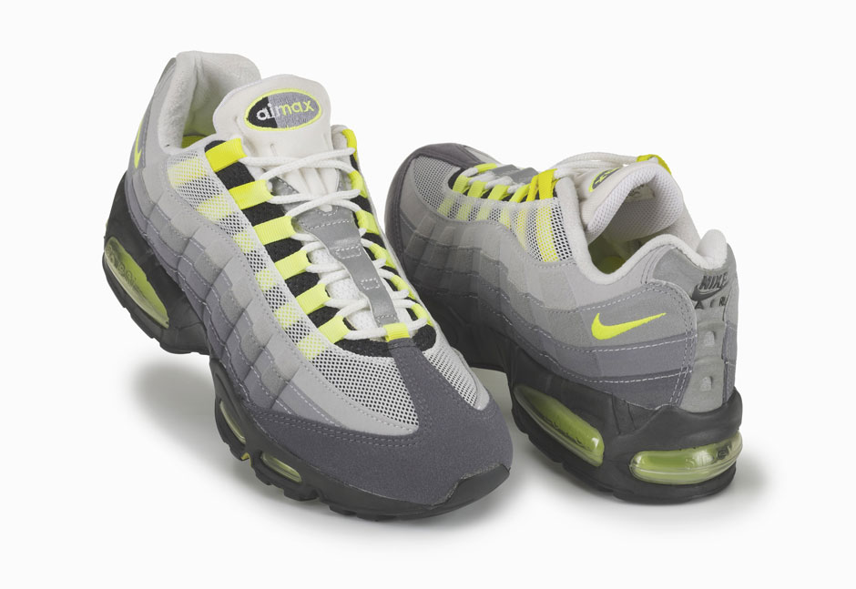
With the mentorship of Tinker Hatfield, who compelled the young designer to find an authentic story to the visual concept, Sergio Lozano put the finishing touches on the Air Max 95. The describe this beauty in a few short words: the lines and curves were inspired by the Grand Canyon, the black midsole was selected as a means to mask dirt – an insight he gained from Nike ACG, the neon yellow was a nod to origins of Nike Running, and the unconventional details take after the human anatomy. Once this masterpiece came into production, it didn’t take long for the silhouette to get the co-sign from the running circles and the hip-hop culture from hemisphere to hemisphere.
Continue on below for an interview with Sergio Lozano as well as a look at some early design sketches.

How did you get involved with the creation of the Air Max 95?
I started with Nike in 1990 and during those years there were only a handful of footwear designers. We all worked across lots of different categories, which wasn’t uncommon for a designer at that time.
I had been working at Nike for about four years juggling tennis, training and ACG. But tennis and ACG were my main focus. I was approached about designing a running shoe and it sounded fun so I said, “sign me up.” This was around 1994, a time where running as a category was important but a bit of an underdog compared to basketball. Air Max had its legacy but it hadn’t quite reached the level of massive popularity it is now known for. The running team wanted to mix things up a bit, they wanted to take a risk, I guess I was that risk. Everyone around me kept saying, “just go have fun,” I was still young and a bit naïve, in a good way, and that was all I needed to hear.
Were you briefed on this project? If so what were you told?
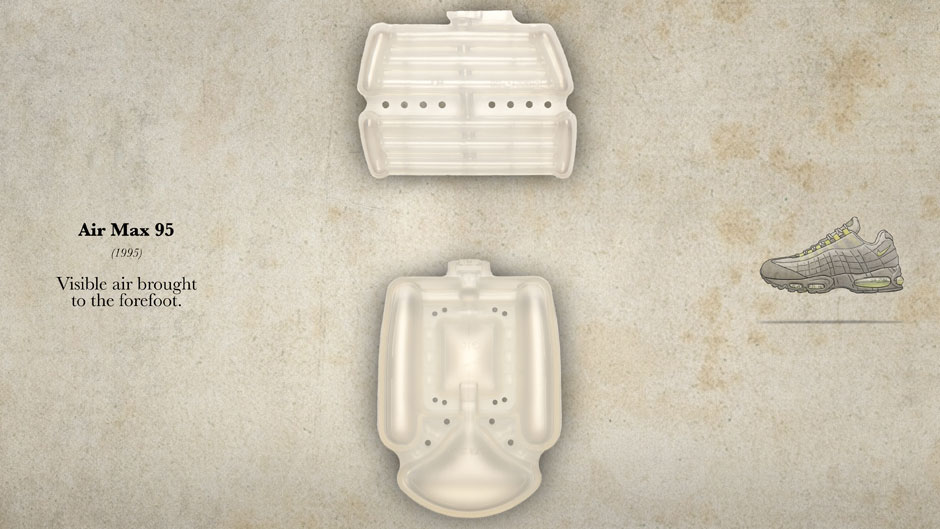
I don’t remember a formal written brief. But I can recall a few critical conversations that I had with the developer, product marketing, and the running category leads. The category lead was a very outside-of-the-box thinker, and a tad controversial at times. Personally I think that gave him a little edge. We knew that this product would introduce visible air in the forefoot, which was driven by the innovation team, and we knew that we wanted to be disruptive. We focused on the runner that wanted a bit of protection. That was it.
Once your were briefed can you describe your design process for this project?
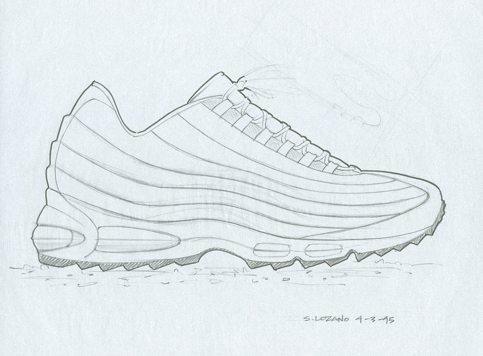
So I was working in ACG before I inherited this project. My space at the time was in the Michael Jordan building with a window facing the lake. It was actually the best view I’ve had since I started with Nike. One rainy day I was looking across the lake out into the trees and I began picturing the process of rain eroding the earth. I thought to myself wouldn’t it be an interesting story if we found the perfect product underneath the ground and it was just unearthed by elemental erosion? From that thought I made a little sketch of a shoe that had striations very similar to what you see on the walls of the Grand Canyon. Layer after layer after layer that are slowly revealed over time. I quickly finished the sketch and stuck it into my idea drawer.
It didn’t connect to anything I was working on but at the time I figured it would make a good ACG shoe. The sketch sat in that drawer for a while. We brainstormed several ideas for this shoe. Most of the other options were more traditional running shoes, stuff that we had done before. I went back to my idea drawer and found the sketch. If we were trying to do something different, we should build the shoe in a way that hasn’t been done before. That’s why that particular idea stood out. I may not have come up with that idea had I not thought about it from the perspective of a different category. I felt this idea could lead to a different approach for this shoe. I would be lying to you if I said I calculated every move and every decision, it was more a feeling that we built on top of and got excited about.
When did the anatomy inspiration come into play?
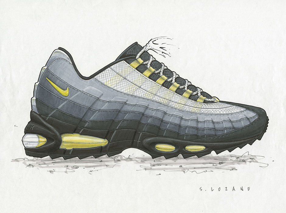
I remember something Tinker Hatfield used to always bring up while working on other projects, he would say, “Okay, so that’s a great design, but what’s your story?” He was always asking “why,” so I asked myself the same question. I wanted the shoe to guide people through my thought process. We had a couple of anatomy books in our library at the time, because we didn’t have the Internet as a resource back then, and I started looking at the anatomy of the human foot. I liked how there were so many interesting analogies on the way our bodies were created that correlated to how Nike made its products. All I had to do was pick the links that made the most sense. The rest was really organic. The original vision didn’t really change from the very first presentation to what we finally created.
Were there any obstacles that you had to overcome to make your vision a reality?
I had only been here for four years, so it wasn’t like I had a ton of stature and credibility in the company. There were some great champions who stood behind the idea and without them the shoe wouldn’t have been made. The first concept review for the Air Max 95 wasn’t a success across the board, some people thought it was good and others didn’t like it at all. The color alone was a very big issue, we were even told to explore other ways of coloring it once we had final approval on the design. The design itself didn’t necessarily look like a running shoe. The idea of using a very small Swoosh was also pretty controversial. Don’t get me wrong, the feedback was not overwhelmingly negative but it wasn’t an instant success either. There were lovers and haters. But you know you’re on to something when you get that kind of emotional reaction.
The Air Max 95’s coloring was a big departure from that of a typical running shoe, what made you choose black, grey, and neon?
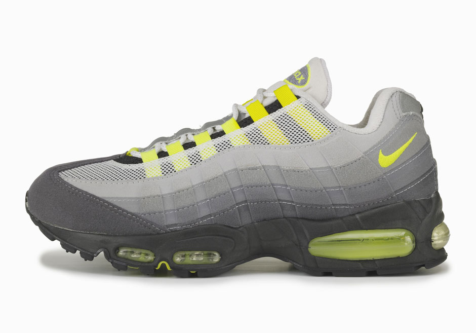
It might come off as a bit naïve but this was a really simple decision for me. I wasn’t a running designer so I didn’t think about it too much. I wanted to use color functionally to disguise the amount of dirt and junk that gets on people’s shoes. In Oregon, people run when it rains, they run on trails, and after the first five miles their shoes look like hell. I was trying to disguise it a bit.
I can’t remember who said it but, during those years I was told that gray didn’t sell. I took that as a challenge. Let’s create a shoe that uses gray in a compelling way that also has a functional purpose. The neon isn’t new now and it definitely wasn’t new then. It came from Nike racing heritage. If you look at some of our racing stuff, like cross-country spikes, those highly visible colors had been used pre-1995.
The Air Max 95 is also known for it’s almost complete lack of a Swoosh. What inspired you to keep that aspect as small as possible?
The original design didn’t have a Swoosh at all. We figured Nike as a whole was pretty recognizable and that we should have a little swagger. We wanted the design to stand on its own. Why did we need it? We already had a lot of things in our favor. We already had visible air and we were debuting forefoot visible air on top of that. Also, where would we put it? We couldn’t put it in the middle of the shoe, where all the action was. The midfoot molding and the webbing are the defining characteristics and we didn’t want to compromise that. So we applied the Swoosh to act as punctuation. Needless to say that was another big point of contention.
When it comes to designing around the Air-Soles what was the relationship like between innovation and designers?
When I got the project, the Air-Soles were already well into development and most of the performance and manufacturing had already been worked out. So I just took what they gave me and designed around it. My job was to decide how much visibility we can bring to it without sacrificing support from the tooling. The next step was carving out as much weight as possible. We were still using Polyurethane at that point and it’s much heavier than the Phylon we are using now. The last step was making sure the molded upper translated to the midsole and outsole.
The Air Max 95 is known for it’s suede panels but isn’t there a story behind the mesh as well?
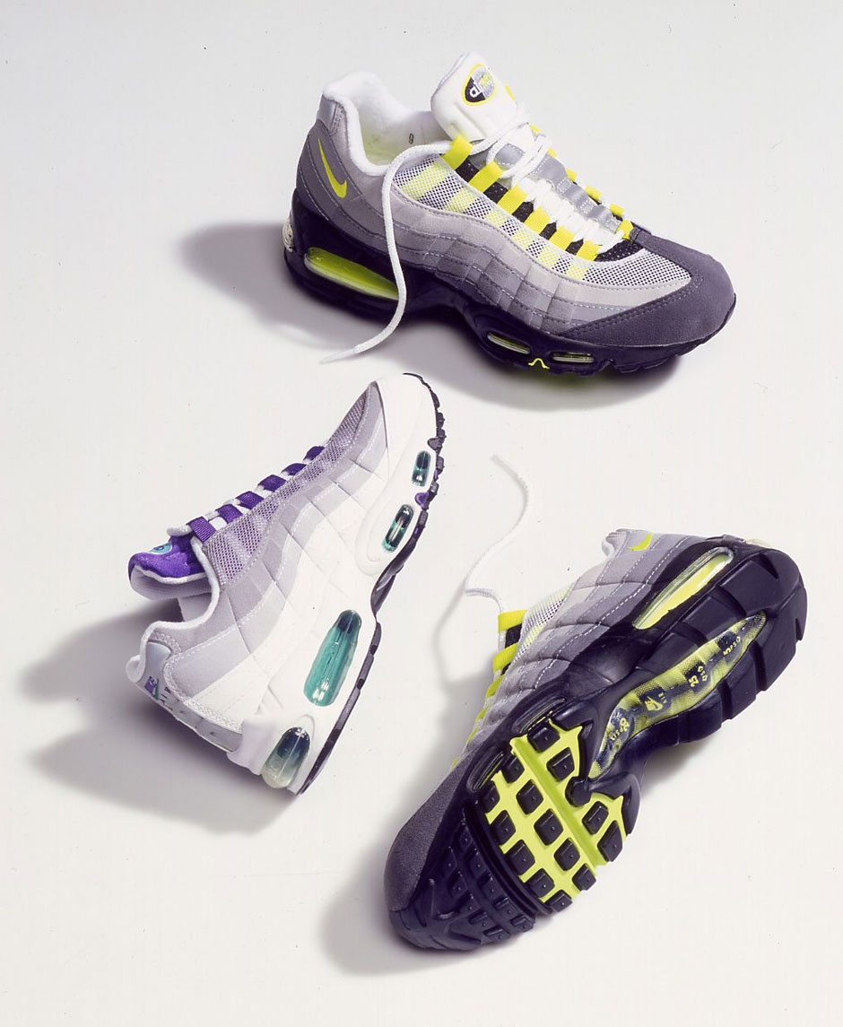
When I met with the lab they said your foot perspires the most at the top. So we made sure to engineer the breathability through the lace area and tongue.
This shoe also marked the emergence of a brand new Air Max logo. What was your involvement? Did you design it?
I didn’t work on the logo. Our brand design team created it. That logo wasn’t just for the Air Max 95 either. It was going to be used on training and basketball shoes as well.
